Skip to content
Saksham ShuklaVerizon · HyderabadOpen to work

Saksham Shukla

Product designer for AI and in-car products.

Message
Shipped work
3
Own products
4
Years
4.5+
WorkPostsReviewsAbout
Hyderabad, India

Posts

Saksham Shukla·16 Nov 2026

Made a reel of everything I’ve designed and shipped so far 🎬

• tello.ai: agentic AI for plan selection at Verizon, +7% conversion• Bang & Olufsen: in-car audio, shipped in Hyundai and Skoda• Harman Kardon One Audio: shipped in BMW and Subaru• Bracket: #9 on Product Hunt• DarpanAI: an AI video director with paying creators• Plug and RelayOS: AI products for finance teams and manufacturers

Have a look and tell me which one you’d want the full story on 👇
Saksham Shukla·9 Nov 2026

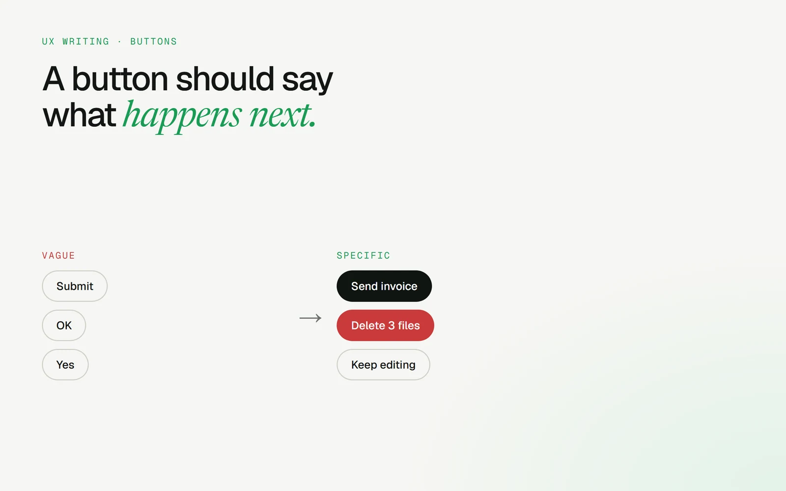
“Submit” is the laziest word in UI. ✍️

Users shouldn’t have to read the whole screen to know what a button does. The label is the promise.

Instead of:• Submit → Send invoice• OK → Delete 3 files• Cancel → Keep editing

Verb + object. Every time.

Bonus: when the action is destructive, put the number in the label. “Delete 3 files” makes people pause in a way “Delete” never does.

Vague buttons (Submit, OK, Yes) next to specific ones (Send invoice, Delete 3 files, Keep editing)
Saksham Shukla·27 Oct 2026

The hardest problem in AI products isn’t the model. It’s this:

How does a user trust what the AI just did? 🤔

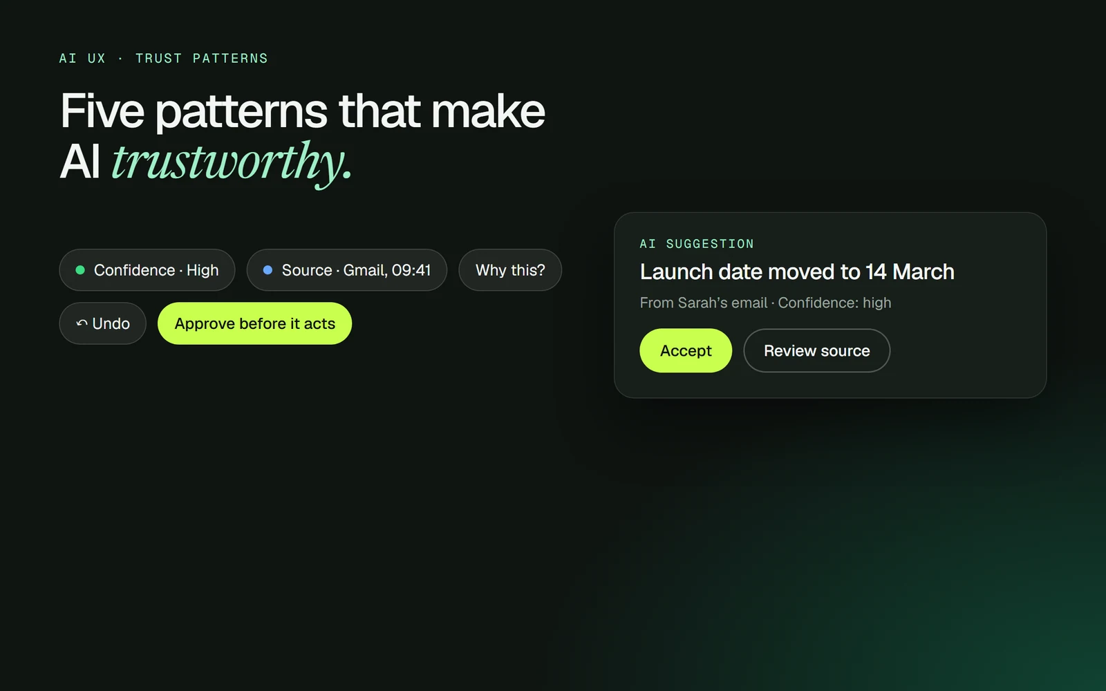
5 patterns I keep coming back to:• Confidence: say how sure the AI is• Source: show where it got the answer• “Why this?”: one tap to the reasoning• Undo: every AI action is reversible• Approval gates: the AI asks before it acts on anything that matters

None of these are flashy. All of them decide whether people come back.

Which one do you see missing most often?

AI trust patterns: confidence, source, why this, undo and approve before it acts, around an AI suggestion card
Saksham Shukla·1 Oct 2026

Bracket is live on Product Hunt today, and it finished #9 🚀

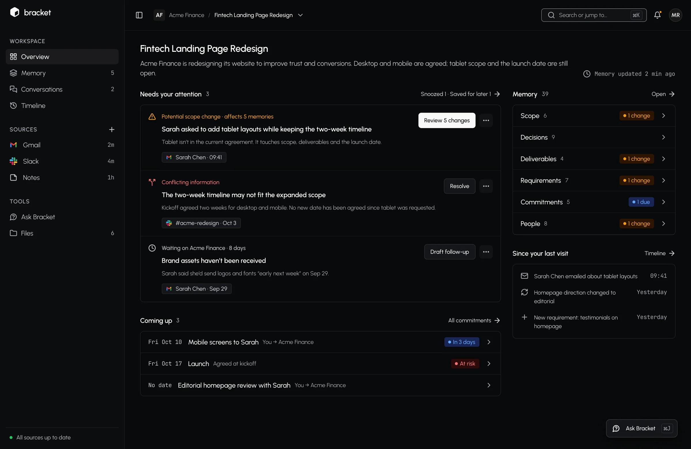
Bracket is an AI memory for freelancers and small teams. It detects decisions (scope, dates, prices) inside email and Slack threads, then asks a human before updating anything.

The design rule I didn’t compromise on: the AI never changes anything on its own. Source on the left, the AI’s reading on the right, one click to accept.

Built it end to end:• 53-component design system• 173 screens with clickable prototypes

Thank you to everyone who upvoted and left feedback 🙏

Overview: what needs you, split from what just happened
Case study →
Saksham Shukla·2 Sep 2026

Most handoffs show one button. Engineering needs six. 👇

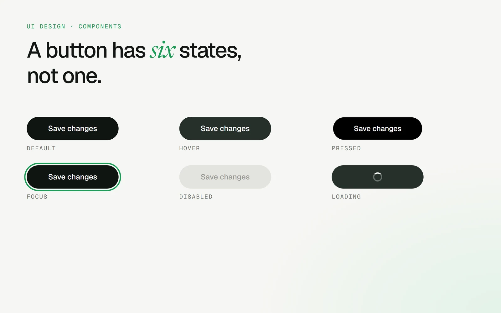
• Default• Hover• Pressed• Focus (a visible ring, for keyboard users)• Disabled• Loading

Loading is the one teams forget most often. Without it, people click twice and you get two payments, two emails, two orders.

If a state isn’t in the file, someone will guess it in code.

One button shown in six states: default, hover, pressed, focus, disabled and loading
Saksham Shukla·30 Jul 2026

Your icon can be small. The tap area can’t. 👆

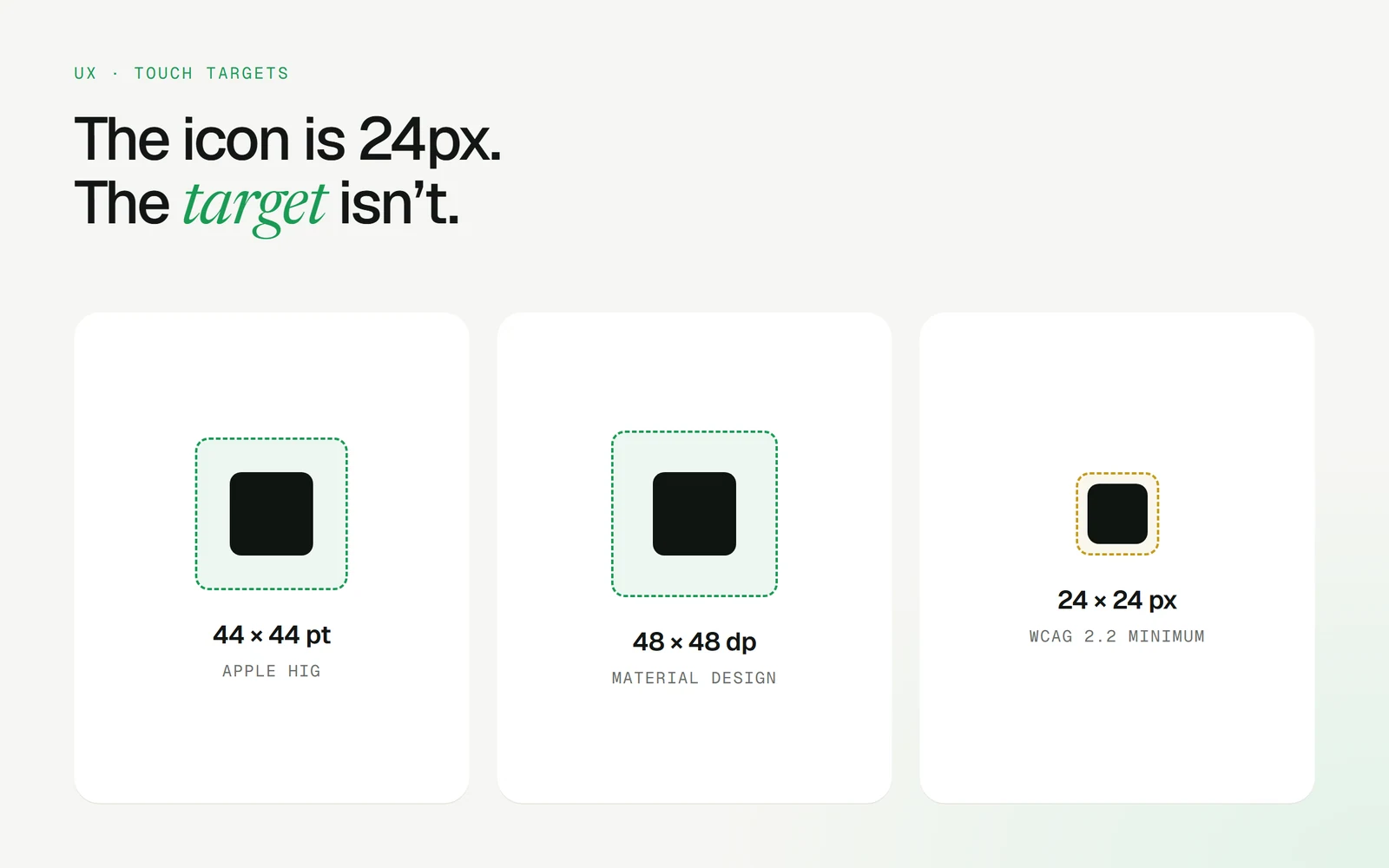
The numbers worth remembering:• Apple HIG: 44 × 44 pt• Material Design: 48 × 48 dp• WCAG 2.2 minimum: 24 × 24 CSS px

Pad the hit area, not the icon. And keep enough space between targets that a thumb can’t hit two at once.

This matters even more in a car, where people tap at arm’s length on a moving road.

Touch target sizes: 44 by 44 points, 48 by 48 dp and the 24 by 24 pixel minimum
Saksham Shukla·24 Jun 2026

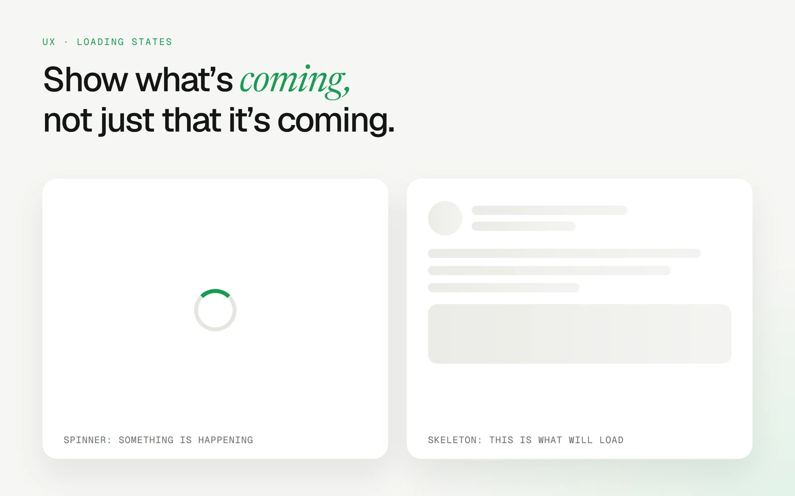
A spinner says “wait”. A skeleton says “here’s what’s coming”. ⏳

When to use which:• Under about a second: show nothing, or the content just appears• Loading content with a known layout: skeleton• A single action like saving or sending: spinner or progress on the button• Long waits: real progress, and let people do something else

Skeletons make waits feel shorter because the layout is already there. Nothing jumps when the content lands.

A spinner card next to a skeleton card showing the shape of the content
Saksham Shukla·21 May 2026

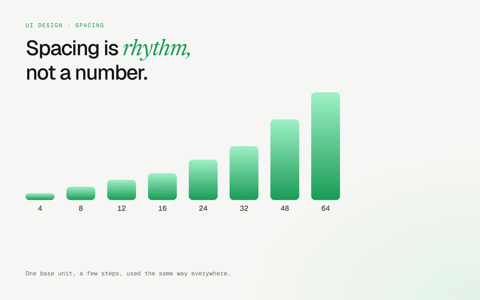
Everyone talks about the 8pt grid. The grid isn’t the point. Rhythm is. 📐

What actually makes a layout feel calm:• One base unit (4 or 8)• A short scale: 4, 8, 12, 16, 24, 32, 48, 64• Related things closer together, unrelated things further apart• The same gap for the same relationship, everywhere

When spacing is consistent, users read structure before they read words.

Bad spacing is the most common reason a “clean” UI still feels off.

A spacing scale from 4 to 64
Saksham Shukla·12 Nov 2026

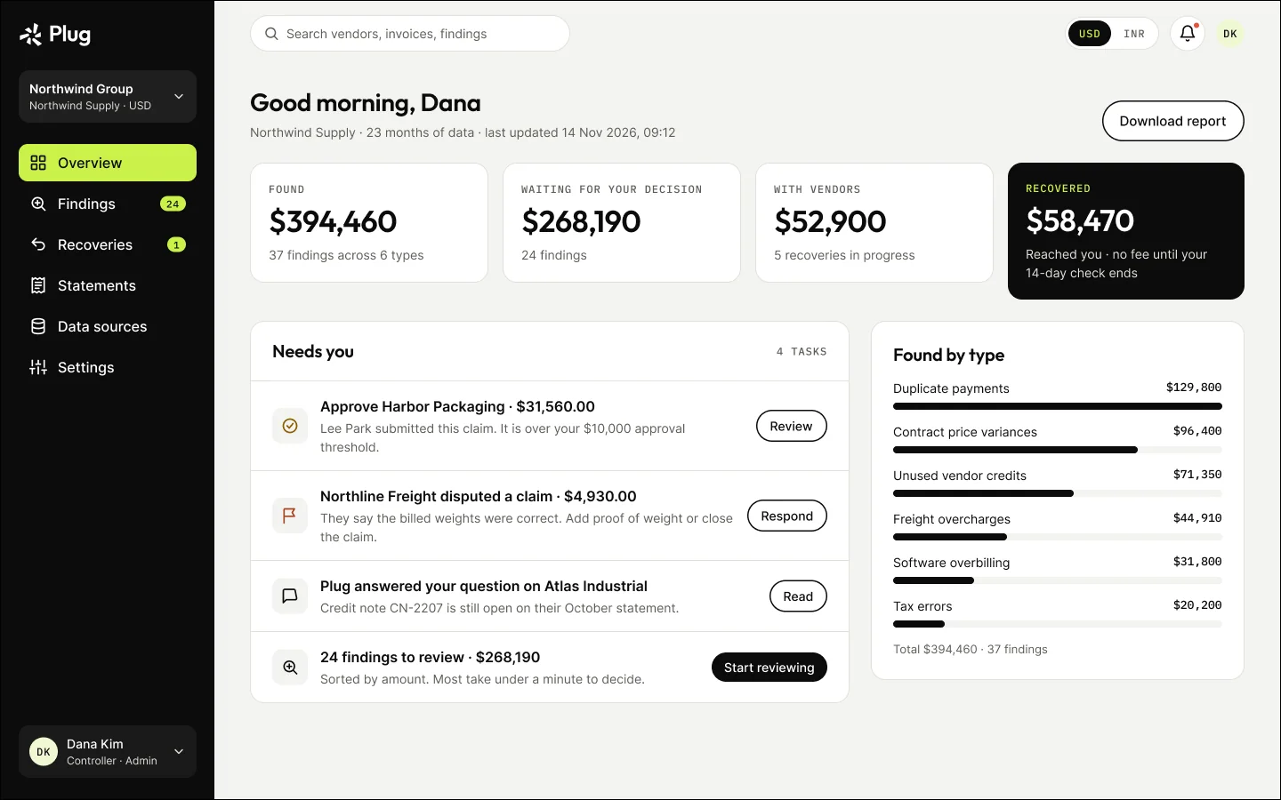
Something new I’ve been designing: Plug 💸

Plug is an AI recovery platform for finance teams. It checks every payment for duplicates and unused vendor credits, explains each finding with its evidence, and recovers the money only after a person approves.

The pricing model shaped the whole UX: Plug charges 15% of what comes back, and nothing if nothing does.

So far:• 39 desktop screens across 7 flows• Loading, empty, error and partial-data states for all of them• A full design system

Launching 14 Jan 2027.

Plug overview: found, waiting for your decision, with vendors and recovered
Case study →
Saksham Shukla·5 Nov 2026

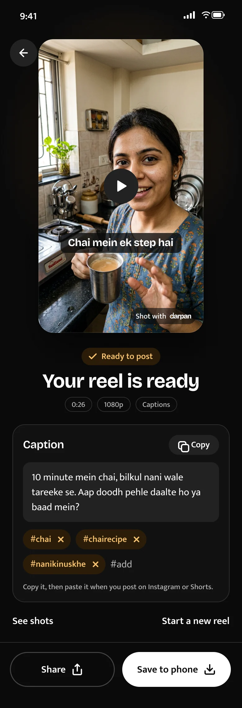
DarpanAI has been live for two weeks. Here’s the honest dashboard 📊

• 65 creators signed up (after removing developer accounts)• 6 subscribed to Pro• 152 scripts → 266 takes → 32 finished reels, none failed• Only 2 creators recorded a take this week

That last line is the real story. Sign-ups aren’t the problem. Retention is.

My hypothesis: the loop ends at export, and nothing guides creators to their next reel. Next I’ll test a guided second reel: every finished reel ends with the next idea already planned.

Building in public means sharing this part too.

Your reel is ready to share
Case study →
Saksham Shukla·14 Oct 2026

“Something went wrong.” 🙃

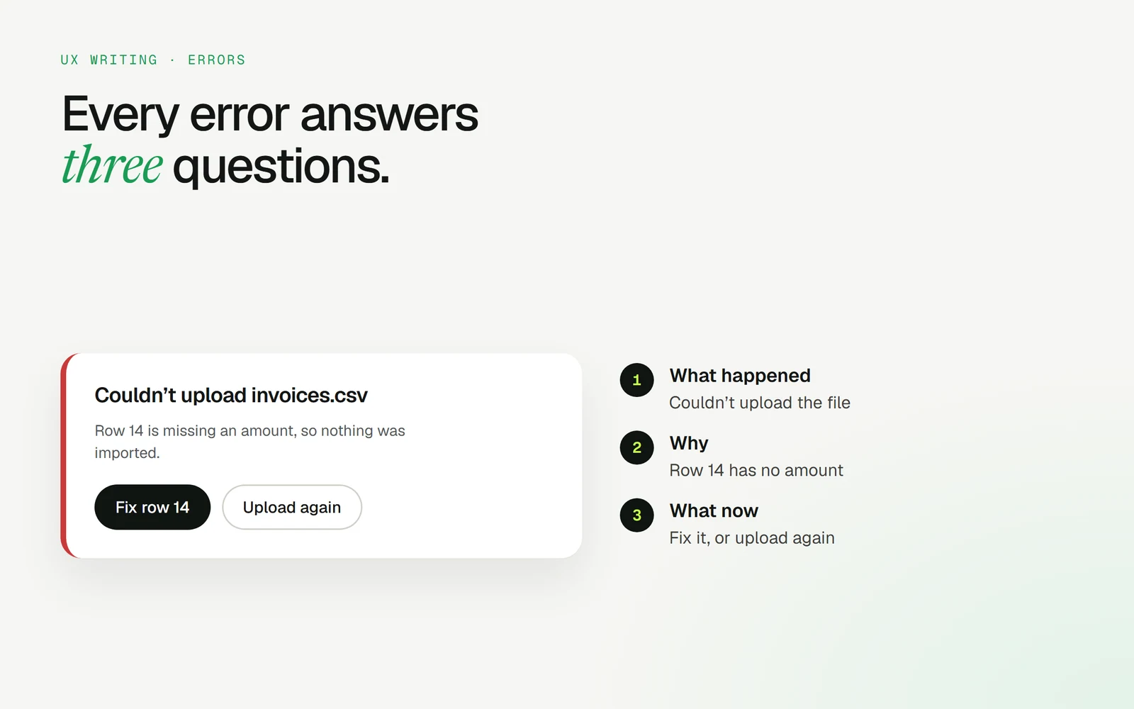
That message tells users nothing. A good error answers three questions:

1. What happened? “Couldn’t upload invoices.csv”2. Why? “Row 14 is missing an amount”3. What now? [Fix row 14] [Upload again]

And a few rules I follow:• Never blame the user• Keep what they already typed• Put the fix right next to the message

Errors are part of the flow, not an interruption to it.

An error card annotated with what happened, why, and what now
Saksham Shukla·18 Sep 2026

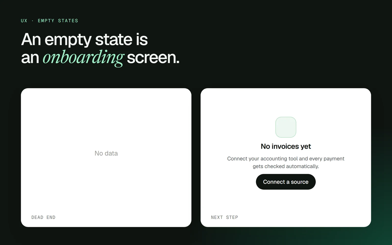
“No data.” Two words, and a dead end. 😶

The empty state is often the first screen a new user sees. That makes it your onboarding.

A good empty state has:• What will appear here• Why it’s empty right now• One clear action to fill it

“No invoices yet. Connect your accounting tool and every payment gets checked automatically. [Connect a source]”

Design the empty state first. If you can’t explain the screen when it’s empty, the screen isn’t clear yet.

A blank “No data” state next to a helpful empty state with a clear next step
Saksham Shukla·19 Aug 2026

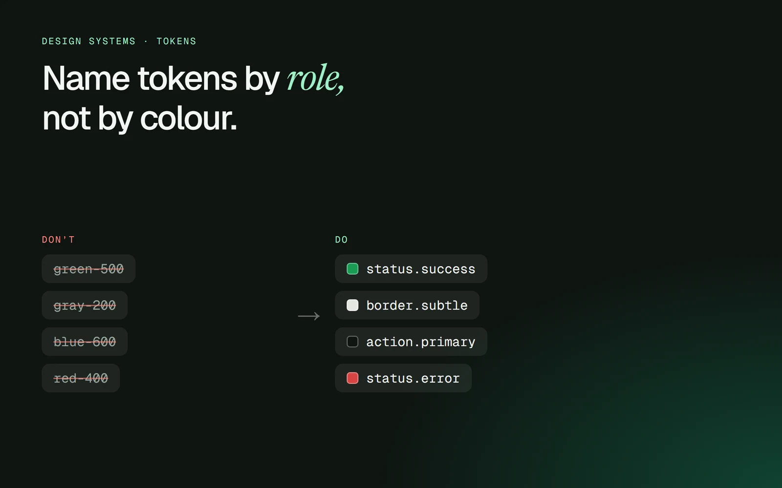
green-500 is a colour. status.success is a decision. 🎨

When tokens are named after colours:• Rebrands mean find-and-replace across the whole product• Dark mode becomes a second design system• Nobody knows if blue-600 is a link, a button or a chart

Name them by role instead:• action.primary• border.subtle• status.success• status.error

The colour can change. The role never does.

Colour-named tokens crossed out, next to role-named tokens
Saksham Shukla·12 Jul 2026

That elegant light grey caption? A lot of people can’t read it. 👀

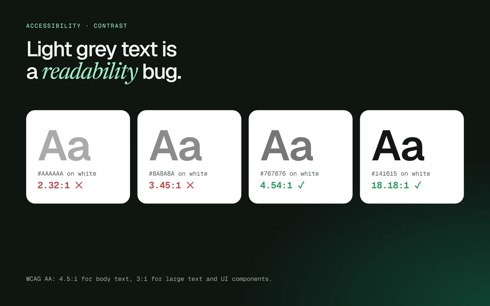
WCAG AA asks for:• 4.5:1 for body text• 3:1 for large text and UI components

Some quick checks on white:• #AAAAAA → 2.32:1 ✕• #8A8A8A → 3.45:1 ✕• #767676 → 4.54:1 ✓

Low contrast doesn’t look minimal. It looks unfinished to anyone in sunlight, on a cheap screen, or over 40.

Check it in the file, before it ships.

Grey text samples on white with their contrast ratios
Saksham Shukla·6 Jun 2026

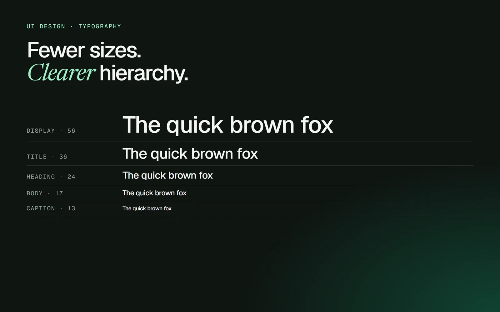
If your file has 14 font sizes, you don’t have a hierarchy. You have a mood board. 🔤

Most product UIs need five:• Display• Title• Heading• Body• Caption

Then build hierarchy with weight, colour and spacing before reaching for another size.

Fewer sizes = faster decisions, cleaner handoff, and a UI that feels designed instead of assembled.

A five-step type scale: display, title, heading, body and caption